Local service · brand, UX/UI, booking system, automation
Ekspres Parking: from idea and brand to online booking and automation, in one pair of hands
Context
An airport parking customer decides fast, often from a phone, a day or two before the flight. They want to know straight away whether there is a space, how much they will pay for their days, how they get to the terminal, whether the car is safe and whether they get an invoice. Every question left unanswered on the site ends in a phone call or a competitor.
The challenge
Build a brand and a service from scratch in which a booking takes about two minutes: dates, package, details and payment, without calling, and without staff retyping orders by hand.
Scope
What I did
- 01Idea and service model: long-term airport parking with a free two-way transfer, 24/7 entry and transfer, online booking and a choice of protection packages.
- 02Brand: a name as a logotype with arrows that say “fast”, a yellow and graphite colour scheme visible from afar, and a simple, concrete style of messaging.
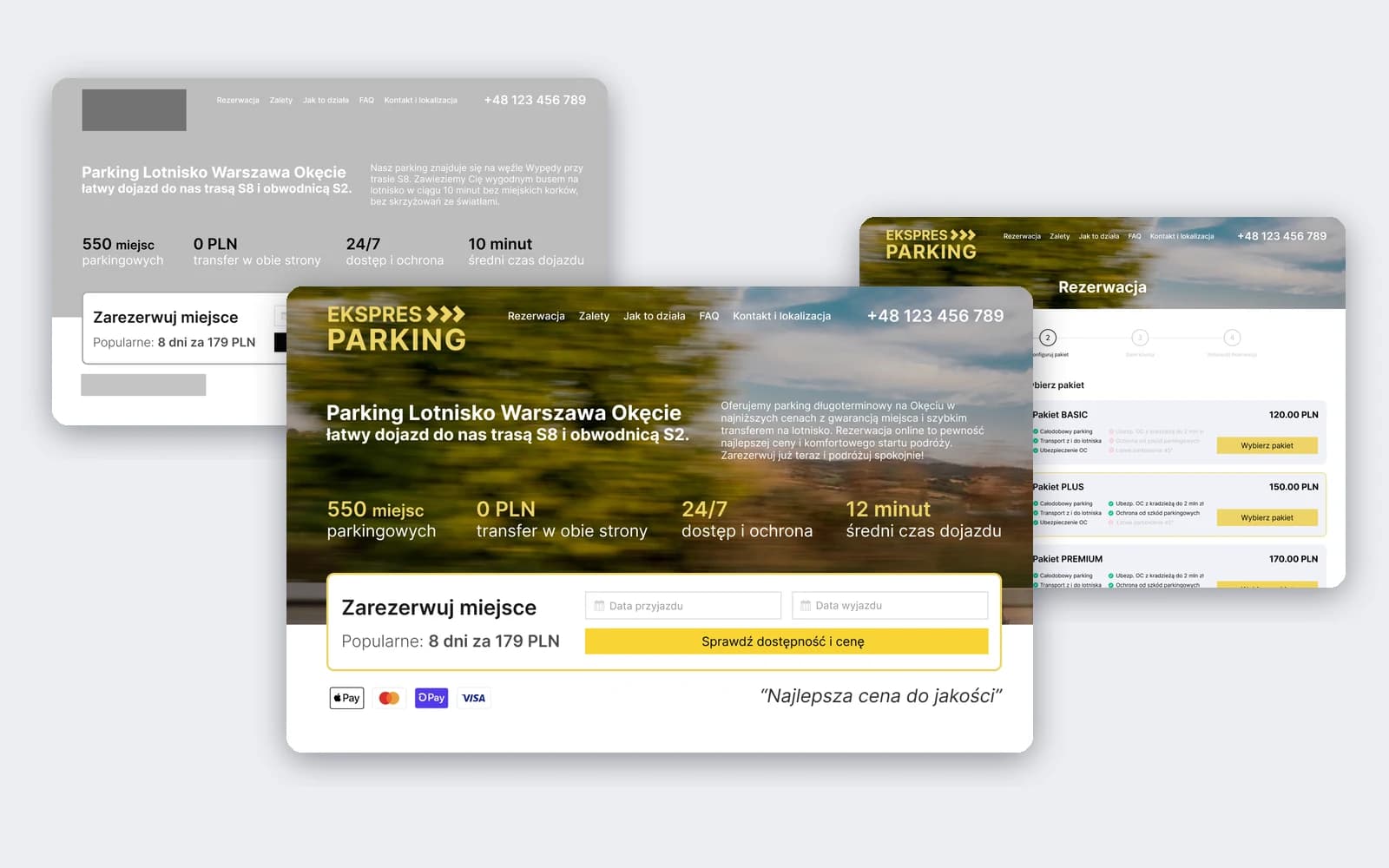
- 03Prototype: grey mockups of the whole path, the home page and the four booking steps, to settle the layout and content first and only then the colours.
- 04Home page design: a booking form with the most popular offer on the first screen, four numbers about the parking, six advantages (monitoring, location, 24/7, transfer, waiting room, paved and lit site), “How it works” in three steps, an FAQ, a route map and a blog for SEO.
- 05A booking path in four steps: dates, a choice of BASIC, PLUS or PREMIUM package with the transfer as an add-on, customer details with the registration number and an optional VAT invoice, online payment (card, BLIK) or cash, and a summary.
- 06Launch of the site and the booking system, and automation of booking handling, so that orders do not need to be retyped by hand.
Key decisions
Key decisions
- 01
Booking on the first screen
Arrival and departure dates are entered right on the home page, next to the most popular offer and the payment icons. The customer doesn't look for where to book, and sees at once that paying will be easy.
- 02
Four steps with the price always in view
Dates, package, details and confirmation. The dates, number of days and the total are always visible at the side, so nothing surprises the customer at payment, and one click goes back to the previous step.
- 03
Packages you can compare in a second
BASIC, PLUS and PREMIUM in one view: green ticks show what is included in the price, crossed-out items show what is missing (theft insurance, protection against parking damage, easy parking). The higher package sells itself.
- 04
A form for the real needs of drivers and companies
Registration number, booking notes and a VAT invoice with company details and tax ID (NIP), expanded only when needed. Online payment by card or BLIK, or cash on site.
- 05
Answers instead of phone calls
The FAQ answers the questions people usually call about: whether to print the ticket, what parking damage is, whether there will be an invoice, whether spaces are assigned. For those who prefer a conversation, there is a clear phone number and the hours for phone bookings.
- 06
Prototype first, then design
Grey mockups let me settle the layout, content and order of steps without arguing about colours, and the brand came in only onto a proven structure.
Evidence
Results
- 01
A complete brand and service made by one person: idea, logotype, prototype, design, website, bookings and automation.
- 02
Online booking in four steps with packages, a VAT invoice, online payment or cash, and a price summary.
- 03
A site that answers the questions that usually end in a phone call: directions, transfer, safety, ticket, invoice.
Stack
- Branding
- UX/UI
- Booking system
- Automation
Services used
Have a similar project? Tell me what you're trying to build and I'll reply, usually within 2 hours.